Aperture Book Themes, changing the colour scheme

One of the slightly annoying things about Aperture is the limitations placed on you when creating a book. Whilst it is incredibly flexible in lots of ways, certainly much more than iPhoto, there are some things I really want to be able to alter.

One of these is the colour scheme in the ‘Special Occasions’ Aperture Theme. By default, you get a pale blue colour for any panel not holding an image. It looks quite smart, and the ‘helvetica Neue Ultra Light font is smart too… but I often find I want to change it. The trouble is, Aperture doesn’t let you do so easily.

Of course, if you fancy digging around in the files for the app then almost anything is possible! It’s not exactly easy, and you should always make a copy of the theme and work on that rather than jigger around with a perfectly good one and break it, but all you need is an eye for colour (and design?) and a decent text editor. I use BBEdit, but you can do equally well with the free Text Edit that comes with your Mac.

First things first – what I am about to do is not recommended, and I take no responsibility for how your system runs after you try it 🙂 Seriously though, work on a back up copy of the theme, and you can always delete it later. Also, it is likely that even if you do change things now, any update to the software could well over write your hard work… this tutorial works with v1.5 of Aperture. Apple have only this week released v2 as an update and it boasts new book themes and capabilities. It seems like a good time for me to play with the current version I have got installed, then!
Show contents
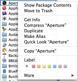
You find the book themes by control-clicking on the aperture application icon (in your Applications folder) and selecting ‘Show Package Contents’ . Navigate to ‘Contents/Resources’ and scroll down to the folder ‘Book Themes’. It’s probably quicker to type ‘book’ as you won’t then have to scroll – the finder will jump to the items with those letters at the start. You’ll then see the themes nicely lined up. Select the one you want to alter and make a copy of it (by holding down ‘Alt’ and dragging the folder to the bottom of the list). You can see that I have copied my ‘Special Occasions’ theme and renamed it ‘Alternate Occasions’. A word of caution – simply renaming the folder won’t give you a new theme name inside Aperture. It *will* list it alphabetically in the theme browser, but the theme list will show two copies of ‘Special Occasion’. We’ll get round to renaming things a bit later on.

Now you have the copy, open the folder and have a look. In my case, the first folder is called ‘Hardcover’ and everything else is in that. The things you may want to change are likely to be the fonts you can use and the colour of the bocks. For the fonts, look for the ‘TextStyles.plist’ file and open it in your text editor. What you’ll see is a series of XML statements which define the fonts in use, the size of them and the colour/style.

Changing Font Colours

TextString

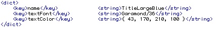
I would leave the ‘Title’ key values alone. these are referenced in lots of other places and changing them here means an awful lot of editing elsewhere. You can also easily change the font in Aperture without needing to edit things here, but these keys control the default settings for the book, so you might want to tinker a little. Changing the default font is simply a matter of changing the key by typing in the name of the font you want to use. I have changed from ‘Helvetica Neue Ultra Light’ to ‘Garamond’.

You can also change the font colour in the last line of the set. These are actually RGB values with a fourth value set to ‘100’. RGB values are from 0 to 255 in each channel, with 0 being no colour, and 255 being maximum colour for each channel. Thus, a value of ‘255, 255, 255, 100’ would give you white text. Similarly, ‘0, 0, 0, 100’ gives you black text. If you have access to Photoshop or any other decent image editor, you probably already have a good idea how these things go. Again, you can easily change the colours of the fonts in Aperture without editing this file, but if you want to set up a new default, set the line as you need it to be.

In some areas kerning may be set, too. If you don’t know about kerning, leave this set as you find it!

Changing the colour blocks

graphics
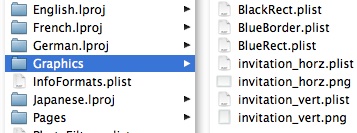
If changing the fonts is not enough for you, how about finding the colour blocks and changing those? Open the ‘Graphics’ folder and look at the files there. The one I am interested in is ‘BlueRect.plist’. open this in the text editor and you will see a very much more simple set of code. All you need to do is change the value for colour, using the same system as above. For example, if you want a pale lilac block colour, set the values to be ‘235, 222, 241, 100’. Again, if you use Photoshop you can find these values very easily – use the colour picker tool and open up the colour setting dialogue. Move the target around in the colours and watch the RGB values change. When you have the colour you want, note the values and set them in the text file… easy!

Changing the Theme Name

So far we have been tinkering with the fonts and colours. You have already renamed the theme folder copy and when you make your book in aperture you get the new theme in the list of available books, but the name has stayed the same (despite renaming the folder). You can rename the theme so that it appears as you want in Aperture by simply opening the ‘Localizable.strings’ file found in the relevant ‘.lproj’ folder for your language. In my case, I open the ‘English.lproj’ folder where there is just one file. Open it in your text editor and look at the top of the file for the ‘Theme Name’ setting. Change it as you want and you are ready to go. You don’t need to change anything else in this file for the new theme to work.

Updating the Preview Image

Finally, to make your new theme easy to spot and have a nice icon from within Aperture, open up the ‘Preview.tiff’ file in your favourite image editor and make it look like your theme – change the colours, fonts or whatever. Even change the images to help identify it a little more. Save it back to its original location and you are done.

Restart Aperture

NewThemeBrowser

In order for your changes to show you need to re-start aperture. When it is running, try adding a new book and look at the list of options you now have. If all has gone according to plan, you should have your new theme showing in the list, ready to use.

If you combine your new theme colours with the existing ability in aperture to create new master pages then you have the opportunity to create some radical new layouts and over time I hope many people do.

Want to share themes?

Now you know how to edit your Aperture themes, why not provide a few for others to use? If ever there was an application crying out for additional content, this would be it, in my opinion! To get a new theme running, simply unzip it, put it in the ‘Book Themes’ folder and start Aperture. To get things going, have a copy of my ‘Alternate Occasions’ theme. It hasn’t changed much, just a font and colour change, but there is plenty more that could be done to make it more attractive. Over time, as new things change, I’ll update the file here.

AlternateThemeLilac

RUGroom at City College Norwich

One of the proudest moments for me recently was on Friday 8th February at City College, Norwich. This was the grand opening of the RUGroom space, which was created in less than one year and has been in use for the last few months. Our role was to initially specify the technology that would best support and extend the learning opportunities and in so doing we found we were getting more drawn in to the physical design. Not wanting to do a job badly, we called on the skills of Team A Go Go to help with the interior design. The blend of our combined knowledge and understanding of spaces and how they can be used has resulted in a unique space which is providing first class support for the students, who are all autistic.

We combined our knowledge and understanding of how technology can be used to engage learners with our approach to digital creativity and created a program of events, which we delivered to the college on a week by week basis. At the same time as this, we invited a small group to our offices in Chelmsford so that they can help specify and design the online space, too.

The opening on Friday was attended by none other than Charles Clarke, MP for the City and former Secretary of State for Education. He spoke of the potential that is within all learners and the importance of unleashing that, which of course is what we believe, too! Our programme of sessions, run brilliantly by Matthew Eaves, has shown repeatedly that there are ways to engage all learners, and it is about finding the way in… technology is important, but interestingly, not always essential. A lot depends on the learner, the subject and of course the purpose for the activity.

The BBC ‘Look East’ news team were there in the shape of Louise Holmes (who we worked alongside in 2006 with the BBC Blast project), and the event was reported on BBC Look East throughout the afternoon and early evening. A snapshot of this is available on YouTube.

There is more about all this on the Digital Creativity web site, which explores what we did, why we did it and what we found out.

Nikon Camera Control Pro Software

Having written in glowing terms about Scott Kelby, who recommended the use of Nikon’s Camera Control Pro software, I now find I am going to speak less favourably about it.

OK, first, it almost works well and certainly I was able to shoot images and see them on my laptop screen, writing direct to hard drive. I could control the camera settings from the laptop and generally not have to touch the camera at all – good if you want to keep things still, certainly.

However, I have some gripes. Chief amongst them is that this software costs money, and it really isn’t all that good as an application on a Mac. In fact, it probably works better on a PC, since the layout of it was pretty counter intuitive. For example, when you use mac software you generally get a very logical experience. So when you take a photo and send it to your computer you’d expect it to appear on screen right away (or as soon as it ‘lands’), right? Well, no… you have to set a preference so that the image can be viewed. This just isn’t right, in my opinion.

Then you get the issue with speed. Resizing the window takes an age, whether you are viewing a RAW file of 15Mb or a JPEG of around 4Mb. There are only two size options pre-set – 100% (way too big for a laptop screen) and 50% – usable, but not great. At 100% you get scroll bars, which do not move. Where is the ability to set the scale exactly as you want it? Or do we rely on the infinitely slow resize the window and click the button that fits to the size you create?

Moving back and forth between images… ? Be prepared for a wait. A long, long wait.

It was excruciatingly slow and I thought there must be an update. There was – I had downloaded and installed version 1.3, and there was a version 2 ‘Pro’ application as a trial, too. The change og didn’t look impressive – basically added some functions for the D300 and D3 cameras. Fair enough, but I wanted to try it all the same. I downloaded it and ran the installer, which kindly informed me that it had to remove the earlier version before it could continue.

And that’s where it all stopped.

Version 2 wouldn’t even install on my system (OSX 10.5 ‘Leopard’) and just sat there eating resources as it did very little of any use. OK – it could be that it isn’t keen on the current flavour of OSX, and to be fair there is a suggestion on Nikon’s web site that hints this might be the case, but again – if it doesn’t work on Leopard, don’t let it start the installer (there’s plenty of apps that check the system before they install)!

So I am left with a great urge to shoot ‘tethered’ and no ability to do so. And the price for this is around $70, so I shan’t be parting with that money just yet, then.

This software really ought to be free. I can’t imagine anyone using this and thinking it was a good experience, and yet the potential for it is simply massive. As a free download I might live with it (and wouldn’t use it much). As a paid download I would feel absolutely cheated. Its a good job there is a trial period!

So come on Nikon – get your act together on this one. Give us the right functionality, get it working in an intuitive way, and get ALL of the features running at the right speed, please! I’d be happy to help you do this if you need someone to act as part of a focus group of testers – but until then I won’t be giving you any more money (well, for software at least).

Scott Kelby, photography and a 50mm f1.8 lens

book_coverI have just bought Scott Kelby’s recent book Digital Photography volume 2 and love it. I read the first book and learned that Scott’s style is down to earth and practical. He uses a lot of humour to ease you in to the subject for each chapter, but there are some seriously good tips and hints in each section.

Since I consider myself a learner still (and probably aways), particularly when it comes to photography, I really find this kind of book extremely useful. Yes, there are bits that are probably common sense and need not be said, but then again there will be folk will appreciate the information nonetheless. After all, having your common sense ‘confirmed’by an authority such as Scott can only be a good thing!

One immediate action as a result of reading the book was to buy a Nikkor 50mm f1.8 lens. I love it… so fast compared to even my f2.8 Sigma and the results are tack sharp. Thanks Scott! It didn’t cost a fortune, and I am sure it will be a firm favourite of mine very soon (probably by Friday afternoon, since it will be used for a wedding shoot then).

Reading Scott’s book also prompted me to  go through all of my kit and check out some of the features I know I don’t use so often. One such is the ability to use my SB800 flash gun ‘off camera’ using the wireless connection from my Nikon D200. I love the depth you can get when you move the light around to a different angle instead of blasting right off the top of the camera. Another tip was to shoot ‘tethered’ – i.e. using a USB lead from my camera straight in to my Mac. This needs a piece of software from Nikon (30 day trial) and you’re away. I liked the ability to see the image right on my laptop screen instead of in the viewer window on the back of the camera, but the software leaves a lot to be desired… more on that in another post, I think.

All in all, the two books I now own from Scott are proving to be a goldmine of useful information and I can thoroughly recommend them. The information in the second one about the use of flash is brilliant (no pun intended), and just what I needed to give me the confidence to go off and try stuff out. Buy the book – you won’t be disappointed.

Sweeney Todd Review, Cloverfield Review, No Country for Old Men Review

This has to be a first for me… going to the cinema is frequent enough, but going for a whole day? Shameful! Yet that’s what I did on Saturday 2nd February. Heading over to Braintree Freeport cinema, it seemed the sort of day that was best spent indoors. It was cold, for a start… and with England playing Wales in the opening game of the RBS Six Nations I knew I wouldn’t be sitting restfully at home! So first up, at 11.30am was Sweeney Todd.

I know this story – it was something I had read at secondary school way back in the late seventies/early eighties, so I was not surprised to see so many throat cutting scenes and pie making. What made this film stand out was the acting (although the story is pretty good, too). For a start, the cast was excellent – Johnny Depp in the lead role, Helena Bonham Carter as Mrs Lovett, Alan Rickman as eminently corrupt Judge Turpin and Timothy Spall as his sidekick Beadle Bamford. Fantastic stuff from the start then. The whole film is a grisly portrayal of vengeance as Todd arrives in London to find Turpin and kill him for destroying his life (he has him deported and steals his beautiful wife and daughter). Setting up as a barber, Todd works above Mrs Lovett’s Pie Shop, where the pies are actually pretty grim as meat is scarce and what you can get is too expensive. So begins a partnership between Todd and Lovett – Todd supplies the ‘meat’, courtesy of his cut-throat antics and Lovett cooks the pies which she sells to unsuspecting Londoners. The tale slowly unfolds as Todd works ever closer to Turpin, but things are complicated by a young sailor Todd met on is voyage home. Anthony Hope falls in love with Judge Turpin’s ‘ward’ Johanna, who is in fact Todd’s daughter. Turpin plans to marry his ward, Hope plans to get there first, and Todd plans to kill Turpin anyway! Needless to say Todd achieves his aim, but not without dire consequences to those who he holds dear (and there’s precious few of those). It is a first rate film with excellent acting from Depp, some less excellent singing all round which doesn’t matter one jot and a hugely enjoyable experience overall.

Cloverfield couldn’t be more different. Leaving the previous film with enough time to get some light refreshments it was out of one and into the next.

Cloverfield as a film has been shrouded in mystery since it was first announced. The film with no name turned out to be pretty awful, I thought. A group of teens having a going away party are rudely interrupted when a monster decides the time is right to make an appearance in the middle of Manhatten. Ripping the head off the Statue of Liberty and hurling it into the middle of town seems to cause some disbelief amongst the party goers, but they slowly get the point when the huge creature is seen and the panic starts to set in. Most folk head out of town at that point, but not our intrepid group. After a series of mishaps (the loss of a brother on the Brooklyn Bridge for one) the group decide to head back towards danger to rescue another of their party goers who has managed to leave a message on a cell phone that she is trapped. She is, of course, the love interest of the lead in the film. So begins the sorry journey of rescue and ultimately disaster. One by one the group fall victim to various woes (the best of which is the girl bitten by a smaller creature ‘hived’ off the main dude, and who gradually deteriorates until she eventually dies). The trapped girl is finally rescued and the four remaining make it to the evac site. One gets into a helicopter that leves immediately (we presume she makes it outta there) and the other three board another helicopter which doesn’t make quite so good progress, lingering as they do to watch a stealth bomber drop munitions on the creature which reaches up and swats the helicopter. From there we know the end is thankfully near, as they survive the crash only to discover they are at the feet of the monster (who somehow managed to get from the midst of town to Central Park). The entire film is shown in a very ‘Blair Witch’ manner through the use of a hand held camera being used to document the party 9and subsequent events). At this juncture, however, the cameraman (called Hud), is eaten alive. To cut an already too long story short, the remaining two leave promptly (but not so fast as to forget the camera, of course) and hide under a bridge where they hear the four minute warning. Manhatten is about to be nuked in a bid to rid it of the menace (although there are probably plenty of other reasons to do this, some might say). Needless to say the film ends around about there. Phew… if you are around 15 you might enjoy this film. If you care much about camera work, storylines or acting, you probably won’t. Then again it’ll get rave reviews like Blair Witch – another film I really didn’t enjoy very much.

So from there it was time to eat – a quick trip to Pizza Express (I ought to write another review for pizzaexpressyourself.co.uk) and it was soon time to go back for film number three – No Country for Old Men.

Before I returned to the theatre I took a sneaky peak at the sports bar of the bowling alley opposite. All looked good – England were seven points ahead. I thought it would be close, but that looked promising. How things change!

This was an intriguing film, but one I found entirely unsatisfactory for various reasons. The plot synopsis is simple enough – Llewelyn Moss finds a group of dead Mexican drug dealers in the wilderness of Texas/Mexico border, tracks the ‘last man standing’ to find himdead under a tree with a case containing vast amounts of cash ($2 million, apparently). Fom then on it is a chase as he tries very hard to keep the cash, and a villain by the name of Anton Chigurh tries to find and kill him. To add to this, the Mexican connection keeps sending groups to do the same job. Finally, Tommy Lee Jones is the sheriff amongst this lot who is nearing retirement and wanting to wrap the case up whilst staying alive. The scene is set for a quite enjoyable romp where you would expect the good guys to win and the baddies to lose. Sadly, this is not to be. In an altogether too long film, evil prevails time and time again in the relentless closing in. Javier Bardem plays Chigurh and for me was the best actor on the screen – absolutely the best thing in the whole film, I’d say. However, he evades capture himself, kills relentlessly and narrowly avoids being killed in a car accident right at the end of the film. Oh – if you still care, the Mexicans get the man who after al this time you thought would have found a way to get out of the state and count the cash. The cash… we never see what becomes of it – the assumption is that Chigurh gets it, but once Moss has been killed we never see it again. The film ends with the Sheriff now retired talking about a dream in which he sees himself following his father into the dark. Clearly, it is a metaphor for death, but I’m afraid the film killed any desire I had to keep watching long before this point. I guess the reviewers wil say I am a philistine and what a brilliant piece of cinematography it is. It undoubtedly has merits, but if you like your stories to be complete (all ends tied up), satisfactory and ‘feel good’ then this is not going to be one you’ll enjoy. It is a masterful depiction of relentless evil in the character of Chigurh, but beyond that it left me feeling underimpressed. Sorry.

There was an option to go and see Aliens V Predator Requiem, but by now I had reached the limit. Three films (one good, one bad and one ugly) was enough and no amount of SFX would put that right. I have had a unique day, although I’ll probably try to repeat it with better films another time. Freeport Cineworld is a comfortable enough theatre and the films were such that there wasn’t a lot of youngsters larking about inside (outside is a different matter, as they congregate in the gap between the cinema and the bowling). Johnny Depp remains a top actor in my estimations, but I knew that before putting myself through the experience! All in all it was worth doing as a way of resting and not sitting at home, but I feel a little cheated regarding the last film. And then there was the final score in the rugby to contend with as well. Ah well.